Hello, Hola, Hallo, Bonjour, Nǐ hǎo . . . language is a key way we communicate, introduce ourselves, and convey what we want others to know about us. In the “art and science” of creating great product packaging, it would be ideal if there was a universal language that could do the same and work globally in the communication of brand and product messaging. But in the quest to create packaging that motivates consumers to choose your product and make a purchase transaction, language needs a special set of guidelines in order make text as effective an asset as possible.
Clients come to us for a point of view on language on packs and specifically what we can share about the challenges and best practices in bi-lingual packaging. The economics of creating multiple pack solutions that address different languages for varying target audiences can be prohibitive, so making bilingual packs work is not a trivial consideration.
Presumably in bi-lingual packs there is a diversity of the target consumer audience that necessitates duality. The degree to which you need to make a pack totally bi-lingual in part requires an assessment of how much “language” is necessary to influence a behavioral choice:
-
Is the choice going to be made instinctively, almost intuitively based on visual clues (brand recognition, images conveying an attribute like taste or other sensorial triggers, or a pictorial depiction of the product in use) in which case the metrics for use of text in multiple languages are simpler.
-
If the choice is going to be made based on a cognitive comparison of considerations where the wrong choice could be negative (an ingredient that could cause allergies, or a line extension that has specific characteristics that impact selection like a flavor profile or a functional use) then careful use of messaging, most often expressed in language or text, needs to be clear to multiple native readers.
At Behaviorally we look at all marketing challenges, not the least of them the challenge of the bi-lingual pack, through the lens of our unique behavioral framework. It is simple and easy for your stakeholders to understand, grounded in the academic rigor in the behavioral sciences, and actionable with regard to the only metric that counts in marketing: will a consumer respond to your packaging execution, choose your product over other alternatives, and make a purchase transaction.
We start from the conviction that human choices (none more so than in prompting transactions) are driven predominantly by two things:
-
A compelling benefit (e.g., motivation)
-
A low barrier to act (the absence of friction)
– If a brand or product addresses an unmet need, or a way to enhance their lives, a consumer will sense a Benefit and be motivated to buy.
– If a brand or product eliminates friction or a Barrier to act, it is more likely to be selected or chosen and purchased by a consumer.
Benefits and Barriers in Bi-lingual Packaging
So how does this framework apply to the question of bi-lingual packaging and what guidelines can we put in place for design decision making?
Context is everything and there are several considerations when setting up your own decision trees for bi-lingual design.
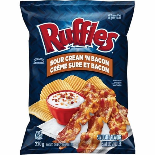
 First of all, is the market in which you are selling the product highly constrained in terms of language? Take Canada as an example, where regulations call for information to be on pack in both French and English in equal size. French is the official language for 22.8% of the population, but Canada has both English and French as official languages (Link).
In this case, non-compliance with what is expected would be confusing and signal a Barrier to choice at the shelf: “can I trust this product meets other regulations for safety or efficacy?”. Would the perceived dominance of one language over another actually turn a consumer away, thinking “this product is not for me”.
In this case, the challenge is to meet the regulatory requirements, particularly for the cognitive communication of Benefits, but also measure the degree to which other design elements (like color and imagery) can convey the more universal (and instinctive) prompts for choice.
Behavioral science tells us that the human brain processes images 60,000 times faster than text and that 90% of all information that is transmitted to the brain is visual. Imagery should be evocative, compelling and emotional, prompting almost unconscious associations with attributes that are equally understood regardless of language. A Benefit of a food item that you want your consumer to infer is “delicioso”, can be conveyed through a mouthwatering image as much, if not more, than a text descriptor.
In our research, the data regarding the impact of visuals is clear: from our studies we know that only 13% of shoppers see text first, 35% see pictures and images first, and a staggering 52% are drawn to color as the initial element seen! Wherever you can in bi-lingual pack designs, leverage this principle.
If an image can’t communicate unequivocally and you are forced to convey claims or other attributes in text, we have found that there are ways to best deliver key information by grouping content by language vs. interspersing it. For example: English Variant / English Benefit followed by French Variant / French Benefit vs. English Variant / French Variant followed by English Benefit / French Benefit.
To reiterate an earlier point to the degree that you can telegraphically and visually depict a message (a picture is worth a thousand words), it will save you “saying” anything once, let alone twice. If your brand iconography is well known, and imagery (or even color) associated with the product or SKU is a key differentiator, lean into that as you design bilingual packaging. It could be the unconscious association beyond the text that drives a purchase choice.
A critical consideration on bi-lingual packaging in a jurisdiction like Canada is that the regulation extends beyond simply an equal number of words, to the accommodation of other regulated communications such as Nutrient guidelines. In a recent article in Food Processing magazine, food export expert Kathy Boyce explained it this way:
“With bilingual (French/English) labels required on all packaging in Canada, U.S. manufacturers must often invest in a full package redesign to convey required information in a way that appeals to Canada’s sophisticated consumers,” says Kathy Boyce, Food Export–Midwest and Food Export–Northeast In-Market Representative for Canada. “Canadian packaging must also be adjusted to reflect Canada’s regulation differences with the Nutrition Facts Table, how ingredients are listed and what health claims are acceptable”.
(And of course, the best advice is to test the ultimate bilingual design solution to make sure it is meeting the Benefits and Barriers threshold you need to motivate Selection and a transaction).
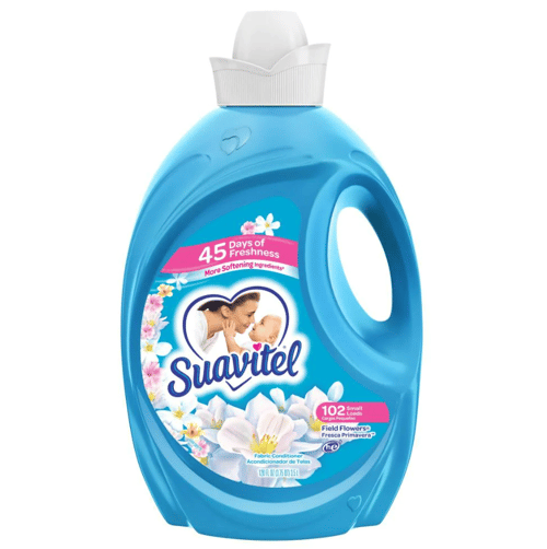
There are certainly some brands that are very popular within certain communities where the cultural diversity or brand preference would tend to favor one language over another. In those cases, many brands choose to have dual language on pack to appeal to a broader audience (i.e., Suavitel includes Spanish on their claims).
The Benefit to this approach is it speaks to personal relevance and being ‘for me’; the Barrier comes in when consumers are forced to work too hard to get the information from a cluttered pack and you may lose the transaction.
When the challenge involves entering new markets (Asia as an example), niche packaging may be the painful answer rather than an attempt to make bi-lingual solutions work. Measuring the balance between brand awareness, category differentiation and openness of a new market audience to try something unknown will be key to the evaluation of niche versus bi-lingual solutions.
The Importance of Standing Out
Whatever the approach you either choose or are obligated to take regarding bi-lingual packaging, the added KPI you need to hit is standing out in the category and on the shelf. In our e-book The Power of Packaging, we shared a model that we use in the evaluation of packaging that determines the potential of your product to be Seen, Shoppable, Seductive, and Selected. The last KPI being the predictor of a shopper purchase transaction. In the consideration of a pack design that will accommodate bi-lingual objectives making sure that your product stands out is not an either/or objective. . . it is definitely AND…! Don’t sacrifice the communication of why your product is a better consumer choice, for the sake of telling your story in different languages.
Our Top recommendations When Considering Bi-Lingual Packaging
The choice to embrace dual languages on packaging is not simple and comes with added complexity and cost, even in cases where it appears to create “one-size fits all” pack alternatives. So key take-aways for the brand teams considering a bi-lingual pack solution?
-
Make sure all stakeholders agree to the objective for dual language packaging: is it a defensive move because we must accommodate market conditions in a territory like Canada? Or are we embarking on the task because we believe it will grow adoption in new markets or with different target audiences/users where our brand is already well known? Once objectives are aligned, a tactical approach to the key factors that will ensure a successful execution can be organized.
-
Know the regulations in the markets in which you are selling your products that will dictate not only the number of words required in each language, but all the other jurisdictional guardrails for claims, etc. that must be followed to be compliant and perceived by the consumer as a trusted choice.
-
Where possible, use imagery that is universally understood to convey softer claims that inspire instinctive associations and prompt the desired shopper behaviors. In the often-unconscious act of shopping, recognizable and compelling imagery and even color will facilitate the frictionless path to purchase, especially when choice is instinctive.
-
Invest in the effort to measure the Benefits and Barriers of any bi-lingual pack design solution to ensure that the pack will provide the maximum impact to influence the only KPI in marketing that counts: a consumer making a choice and a purchase of your product!
If you are interested in measuring your bi-lingual packaging solutions or any shopper marketing executions in the behavioral framework of Benefits and Barriers, contact us today.

THE AUTHOR
Michele McCorry is a Senior Vice President of Client Development at Behaviorally, partnering with clients to define and diagnose the needs of their consumers to drive shopper growth. In her free time, you will find her cooking, enjoying nature and expertly dodging random loose Legos left on the floor by her 5 year old.
