Each week, we will be examining one of the Resolutions you and your e-commerce marketing teams should be making this year to optimize your visual assets to drive conversion at the digital shelf. This week, we focus on why it’s important to keep your images simple.

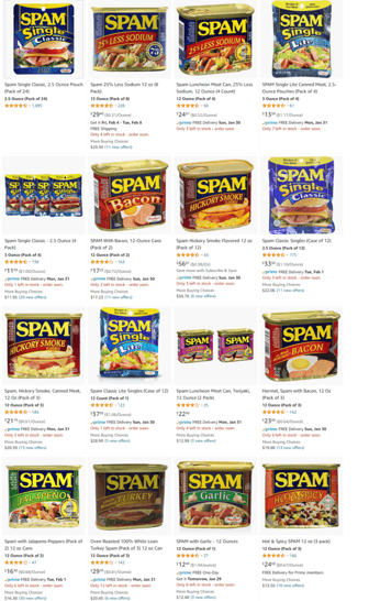
The e-commerce landscape is complicated. Go onto e-tailer Amazon and search “Spam” – do you want it sent via Amazon Prime, Amazon Fresh, or regular shipping?
Do you want a 12 pack, 24 pack, 32 pack, or maybe a year’s supply worth? Do you want the canned version or individual sachets? Do you want Classic, Lite, or Less Sodium? Would you like it to be made of Turkey, Bacon, with Jalapenos, Hickory Smoked, or Garlic? They even have Teriyaki flavored. This is just ONE example of how shoppers are inundated with an abundance of choices.
They expect to find what they want fast, but they are overwhelmed because of this plethora of options. Browsing content online happens very quickly, thanks to the “endless scrolling” behavior that has become the norm on every online site or platform. Whether you’re scrolling through posts on TikTok or shopping on an e-tailer site, engagement with any content, including visuals, is fleeting and brief.
 In e-commerce, brands have a split second to create stopping power and capture a shopper’s attention before they move onto the next item attempting to seek out the product they are looking for. How do they make their choice in the sea of results? The image. It’s the anchor point. A clear, sharp, and distinctive image helps them go, “Yes, this is the product for me.” Text is just supportive to confirm that this was the exact product they were looking for. However, brands need to communicate through thumbnail size images, about a few square centimeters only.
Utilizing our Flash.PDP™ platform, we have analyzed thousands of digital images and found that simplicity is the key to success in the e-commerce landscape. Images that boil down to just the key features or messages of a product into a few highly engaging visual elements are more effective at engaging shoppers than busy images – or even worse, cluttered images with competing visual elements. Blurred or low-resolution images even come off as counterfeit products, raising the red flags in a shopper’s mind.
When designing images for e-commerce, it is critical to remember that context also influences choice, and in the digital world – this context is quick, brief, and super short. You got one second to impress, so keep it clean simple, and drive home the key messaging claims to optimize your conversion rates.
Join us next week on this blog when we discuss our next New Year’s Resolution: How to use brand assets wisely and prioritize what matters most. To learn more about our Flash.PDP platform, and to get a demo, visit https://efluence.ai/ or contact us here with your e-commerce questions.
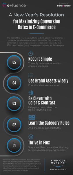
Download a copy of our infographic (pictured right) now.
Visit efluence.ai or contact us to learn more about how we can help you at the digital shelf.
