Inspired by the upcoming Easter season (the last one pre-HFSS?) and the inevitable launch of new products into the Novelty Eggs category, we decided to jump at the chance of showcasing the importance of seasonal packaging.
Easter packaging tends to favour rather traditional shapes and uses iconic colours that we associate with the Easter season. Most brands, such as KitKat, Bounty, etc., of course, have their brand colour scheme to nod to, ensuring quick brand recognition within seasonal specialities.
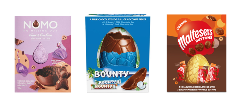
Easter eggs are also rather large items on shelf, so the visibility challenge in this category is much more about breaking through the cascade of colours rather than ‘finding a small needle in a haystack of a shelf’. As such, we knew this was the landscape to utilise Behaviorally’s Flash.AI™ (Artificial Intelligence) tool to predict how successfully different designs breakthrough and communicate on critical benefits.
So what did we do?
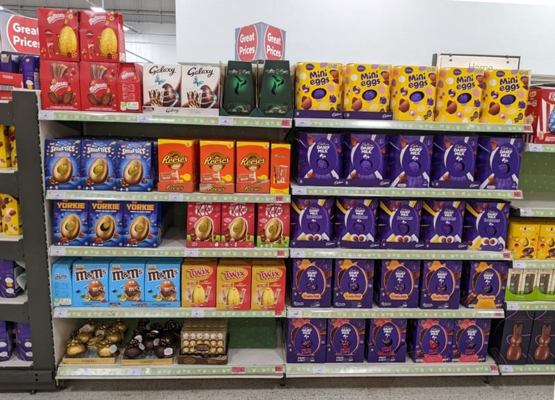
We took around ten Easter egg launches and placed them onto a typical supermarket shelf. Admittedly, this is NOT necessarily the environment where all these brands are to be sold, as some brands may be looking to obtain listings in more specialist retail.
Still, this approach allowed us to simplify the test by keeping the context the same for all brands.
How does the AI work?
Our AI tool assesses the packaging both in isolation and against the context it is placed into via image recognition and uses an algorithm to assimilate predicted results through the lens of our extensive normative dataset of over 24 million behaviours observed – derived from our decades of consumer research.
It is trained to see and process designs as a human would, leveraging our understanding of how consumers process imagery. The analysis produces a comprehensive scorecard from which we have drawn our insights for this comparative analysis. And perhaps the most impressive feat is that it delivers results at the click of a button.
And what did we learn?
Importance of contrast and colour codes
Contrast needs to work at two different levels. Firstly, the design itself needs to create internal contrast and intrusion across its different messaging elements to help comprehension. Secondly, the pack should disrupt the entirety of the shelf through visual elements that quickly captivate within the sea of design noise.
In our tests, the use of the more earthy and pastel tones resulted in the prediction of lower immediacy and overall attention at shelf. It may be that these findings speak to these colours in general and how consumers tend to respond to such tones in food categories, but it may also be an issue driven by the lack of/ineffective contrast.
Perhaps these product designs do not create sufficient disruption from the backdrop of more vivid colours that are competing for our attention.
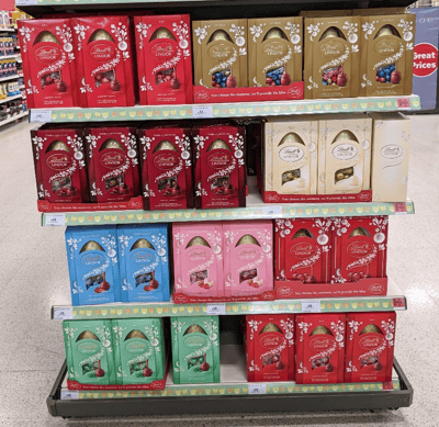
There are brands that have made slightly unusual colours work, and Lindt is one example. The brand benefits from consistency in its packaging that allows navigation to its range. To aid shoppabillity, the consistency in packaging structure allows shoppers to discern more easily that the employment of different colours denotes the offer of different flavour experiences. Within the gondola end, Lindt uses its universal presence to celebrate the depth of its range.
The (predictable) power of Gold
All of the new products that used Gold tones in the exposed foil wrapper were our top scores for communicating relevance and taste in this category. Interestingly the Maltesers option that pictured the egg in gold foil rather than revealed the wrapped egg performed weaker on these aspects, suggesting that using a 3D structure adds to the impact. Essentially the amount of real estate and contrast (through shape and colour) ensure the egg is the visual beacon within the pack.
This also explains Flash.AI’s expectation of the NOMO egg – where we witness a traditional reveal window. Still, the use of matching colour on the foil to the main packaging means that the egg display is not a visual hero.
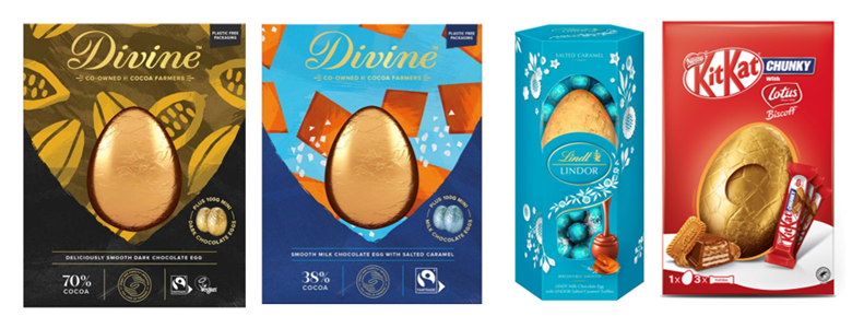
The Divine range shows us how a specialist brand can still work with pack design principles that allow breakthrough among mainstream retail/competition. Both designs are anticipated to benefit from improved speed of attention versus some of their peers. The results were broadly similar for the two variants, although the salted caramel variant with its blue scheme is anticipated to be marginally weaker on visibility and quality impressions.
Why use AI?
The benefit of an AI-based model is to enable consumer-based testing early in the design process, ensuring that pack designs follow known best practices in their development. Time and cost, typically associated with consumer research, are no longer barriers to designing packaging that is optimised based on our 4S model for shopper behaviour.
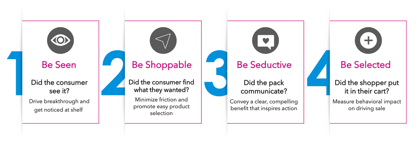
So as we get closer to Easter, stop by the Easter Egg shelf in store, and try to assess your favourite one through this 4S model, and see if you agree with our AI-based findings!

